I was recently commuting on the London Underground and occupying myself, as I usually do, by listening to music. My music taste is broad but thinly spread, reaching almost every genre, though never really delving deeply into one artist or genre in particular. One of my favourite musical styles, though, is film and television scores. Of course, this might be too vague a label, soundtracks covering a vast spectrum of musical genres; Labrinth, for example, uses an electro-pop style in his score for HBO’s Euphoria to create a wilder, more visceral atmosphere, whereas John Williams abides by the grandiose conventions of orchestral compositions. Yet, in spite of these variations in style, timbre, instrumentation, all scores (at least the good ones) succeed in establishing tone and atmosphere, which I myself have come to associate with a certain character or emotion through watching the source material —I would seldom listen to any soundtrack without first seeing the piece of cinema or television which it accompanies.
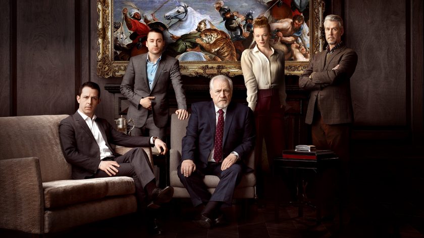
In this particular instance, I was listening to the opening theme for HBO’s Succession by Nicholas Britell — an Oscar-winning composer known for his work on Moonlight, If Beale Street Could Talk, Don’t Look Up, The King, The Big Short, and with many other acclaimed credits to his name. Yet, it was upon this listening as I looked down to check the time on my phone that, as I saw the album cover for the show come up upon the screen, I was suddenly struck by a strange paroxysm. The cover itself is a picture of the Roy dynasty — the fictional family of the show, heirs and founders of a Murdoch-like media dynasty. In the middle, drawing the focus, is Logan Roy, the aged, silver-haired lion around whom most of the show revolves; on the far left sits Kendall Roy, the Daddy’s-boy- turned-rebel who spends most of the show either trying to please or oppose his father; standing nearer to the left, and touching Logan’s shoulder is Roman Roy, the conniving and quippy son who is used mostly for comic relief in the audience’s unanimous adoration of his detestability; standing on the near right and touching Logan’s other shoulder is Siobhan Roy, the intelligent and apparent favourite of her father; and lastly, off in the distant right with folded arms stands Connor Roy, the half-brother with unserious and superfluous dreams of being President and who is not a central agent in the movement of the plot (I admittedly had to look him up to remember his name).
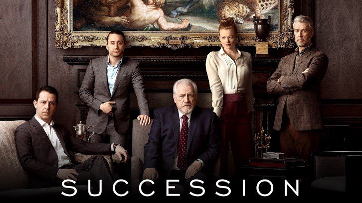
On the face of it, this is not a particularly special cover — in fact, it fits quite neatly into the status quo of modern posters: the central characters brooding together, looking into the camera as though they had just been engaged in some private discourse and were suddenly interrupted. However, I found myself captivated by this particular cover. Why? To understand, we must first understand the feeling the cover inspired. The word that comes to mind to best describe this sentiment — though it cannot wholly, for no word truly can — is uncanny. Sigmund Freud, through all his ramblings, spoke a speck of truth when he described the uncanny as ‘in reality nothing new or alien, but something which is familiar and old-established in the mind and which has become alienated from it only through the process of repression.’ (Das Unheimliche, p.241, SE XVII). Ignoring the latter part of this definition, what we can come to understand by this word is an almost paradoxical sense of simultaneous recognition and rejection, as if the thing in question were something both intimately known and foreign, strange. One might think of the example of a parent whose child had gone missing, and by some stroke of luck had been reunited with them after ten years, though long after adolescence had taken hold; the child that they once knew is unrecognisable, but lost in the growths of adulthood and maturity. It’s a sickly sentiment.
So, what about this cover made me feel this way? How could I be so overcome by something so trivial? The answer lies in the presentation of the characters themselves. Looking at them, scrutinising them, these same characters that I had come to know over multiple years, whom I had watched and judged in the fictional goings-on of their daily lives, who now, all of a sudden, were staring back at me. They had broken one of the fundamental rules of the screen (unless the piece in question is to be an Expressionist work in which case such a rule would be broken many times over so that it becomes normal): the breaking of the fourth wall. Never once, in the three seasons in which I have had the pleasure of watching these characters, had they ever looked into the camera. Yet here, I found them not merely glancing — not accidentally making eye-contact — but staring at me.
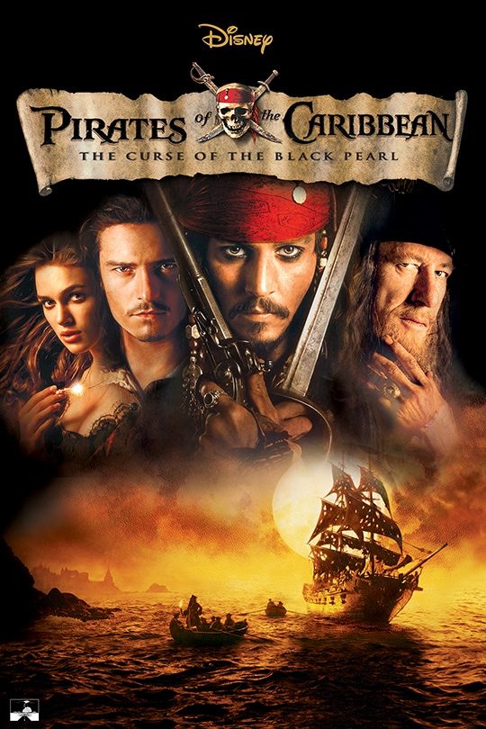
This leads me to question the nature of all posters and covers, for this is a trope which is commonly found, and yet the problems it provokes are never really touched upon. The questions of who exactly these characters are looking at, the paradox of how they can see the camera, how they can be both in character yet acknowledging their audience — none of these are ever posed. Thus, it is my proposal to do so, and to explore how such a thing comes to pass without notice.
In the midst of my various lectures at UCL, I came across a term in a Criticism and Theory lecture: paratexts. This term is used to refer to all things which lie outside of a work of literature, and yet still influence it. The word itself is derived etymologically from the Greek terms ‘para’ meaning ‘alongside’ or ‘beside’, and ‘text’ meaning…well, ‘text’. For example, the title, the foreword, or the blurb all may be defined as paratexts. The supposition is that all these things influence how we perceive a work — this is proof that the aphorism ‘don’t judge a book by its cover’ is an unattainable one, as we all are guilty of it. A book title is the first we know of any work. One can ascertain from the title In Cold Blood that it’s likely not going to be the tale of a princess looking for her lost unicorn doll inside her castle, though indeed I would love nothing more than for that to be the case. These texts are usually for the purposes of commerciality. They are meant to draw the reader in, to entice them, to seduce them, and thus there is the moral debate of how much emphasis it is right to place upon them, as they distract from the real meat of the work itself. It is similar with the world of film and television; while we do not see blurbs and prefaces, as such, we do get posters, trailers — one might even argue that celebrity interviews seeking to advertise a film or show serve the same effect. For the purposes of reference, I will refer to these extraneous pieces of content in the context of film and television as paravisuals.
Yet posters and covers are unique among paravisuals. Trailers are merely edited parts of the piece itself, along with cast announcements, reviews, and some enticing (though often trivial) lines interwoven: ‘One Princess’… [cut to a scene with the princess] … ‘One Unicorn’ … [Cut to a picture of the unicorn] … ‘One journey’. Celebrity interviews are the polar opposite; they present a narrative wholly outside of that of the artwork, the actors playing as themselves, though discussing filming, themes, and theories etc. Posters seem to lie between the two. They are not quite as loyal to and engrossed within the narrative as trailers, yet neither are they as far removed as celebrity interviews. In this way, they are uncanny. One may look upon them and partially recognise the narrative which they are trying to convey, yet by the simple fact that the characters are breaking the fourth wall, the illusion is shattered, and they become costumed actors. The character, in a sense, is like the child, and we as bereaved parents fail to recognise them amidst the strangeness of their actor counterpart.
What then, are we, the viewer, to make of such a phenomenon? What are we to think when examining the poster? Who are we meant to believe to be the person upon whom we are looking? The character? Surely not; a character in standard form TV/Film is prohibited from looking into the lens to acknowledge its viewer, and thus it cannot be them. So, the actor, then? I also struggle to accept this, seeing as the actor is not only in full makeup and costume, but bears the same brooding facial expression which the character wears throughout much of the narrative. We see, then, the poster’s problem, or the poster’s paradox — whichever you prefer. It is that it has found itself, in the name of commerciality, caught between two worlds: that of reality, and that of fiction. I look upon it, and I do not know whom I am regarding. When looking upon the Pulp Fiction poster hanging in my bedroom (yes, I am fully aware of how unoriginal that makes me), am I looking at Uma Thurman, or at Mia Wallace? When I look upon the star-studded poster of Villeneuve’s Dune, am I looking at a group of smouldering actors, or a fourth-wall breaking set of characters? And if so, if we have established that they do in fact possess the power to break the fourth wall, why do they not do it within the film?
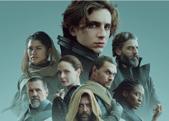
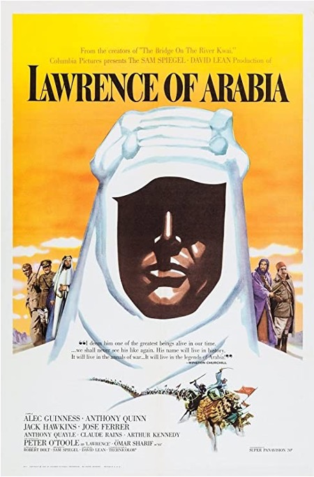
I can hear many of you from beyond the page sighing — yes, perhaps I am over-complicating things. Yet I could not, and still cannot help being captivated by such an immense sentiment of sickliness and confusion at this clear incongruence in modern media marketing. Whether that justifies my rambles, I cannot be sure, yet I can most certainly predict that any readers of this text might say that it is unjustified unless I can propose some solution. To this, the only solution I can propose is that we change out approach to posters. It has been common in recent years to have the stars look directly into camera, the lead in front, the damsel behind, and the sidekick at the side. What I instead propose, is that we take a leaf out of the book of the world of publishing (pun very much intended). Books are made of words — there is no visual medium to aid them, unless they are illustrated in which case most are only sparsely so — and thus with the book cover, the publisher must source a completely new visual aid to entice the reader, to catch their eye. I suggest that we follow in a similar vein for film and TV. Such feats are not unbeknownst in the film poster world — the first which comes to mind is the poster for Lawrence of Arabia, one which is equal in effectiveness and iconicity. Here, we see a piece of visual art that is separate from the narrative of the film. It is a silhouette of T.E. Lawrence in his white shawl, with his face largely covered in darkness so as to obscure his gaze. What makes such a poster work is that it is not attempting to be completely connected to the film itself; it is not a still shot, it is an illustration of brand-new construction, intended, like a book cover, to entice the consumer. This method maintains fidelity to the laws of the worlds into which we are putting our faith, and which modern posters betray, and thus it seems a suitable option.
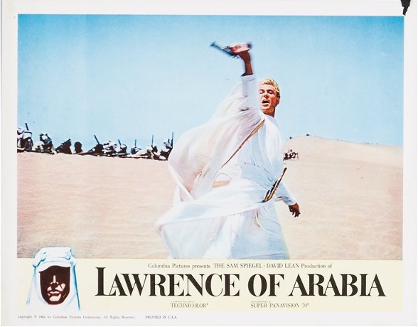
I am not suggesting that we eradicate the use of still shots — some posters are very effective in capturing a moment in a story of great intensity. Such can be seen in an alternate poster for Lawrence of Arabia, and the one which, if you go to iTunes to purchase it, you will probably see. It is a picture of Lawrence in the middle of a charge, though he does not look into the camera, he does not brood, he does not pose, he merely exists. He is Lawrence — completely and whole-heartedly Lawrence — and that is something which I can look upon and put my faith into without the sickly, creeping malaise of incongruence and mistrust in my storytellers.
Perhaps this was an exercise in mere mental masturbation, unimportant and ungrounded in any semblance of sense, though to me it is significant, and that is why I have written it. Even if it is indulgent, I feel it relevant, as these are things which touch us every day, and yet we seem not to notice. Maybe, if no one notices, it is not my place to bring it up, to solve a problem which needs not fixing. Yet for me, like a camouflaged snake emerging from the sand, it has been revealed, and with its venomous bite I am unable to remain idle by it — perhaps this is why it would be cruel to let this document be read, for then I would be revealing to them a harmless yet irrefutable issue which, prior to their reading, need never have made a dent within their mind. Even if this is nothing more than the disassembled thoughts of a teenager slapped upon a page which shall remain unread by all or any, my expression and recognition of the problem has served as some relief, though I envy those that do not notice it.

